Tuesday, 26 June 2012

Jamie Beck - Animated GIF

As apart of more experimentation work for our AS to A2 project, we had to make an animation of something really complicated or something really simple. Jamie Beck was out inpiration. He is a well know photographer and creates excellent animation images. Here are some of his work... 
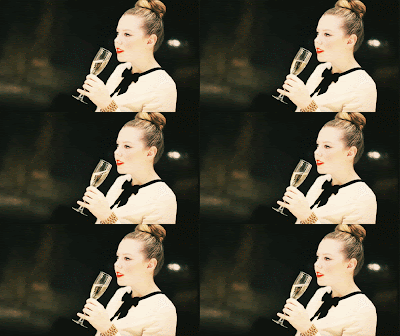


As apart of more experimentation work for our AS to A2 project, we had to make an animation of something really complicated or something really simple. 


The first idea I had was just to make a text animation. The word I choose to make a GIF out of was the word HELLO and then an added smiling face.  I found this animation quite easy to making this GIF. The reason was because it I just had to create a text box and make a new layer every time that I wanted to make a new letter. I choose to make the letters go in a diagonal direction. Also when I creating the text, I made the letters slight bigger than the one before, so it looked like the word was increasing. This animation I was quite happy with because it is very simple. 


For the next GIF I was planning to make, I decided to shoot some photos of my Dad drinking a cup of tea. I tried to make the photos seem like they were in one fluid motion, where I was actually taking the photos by stoping, then starting again. The reason why I decided to take photos of this particular image was because I wanted to make something so simple but it still looks very effective.

Making the animation was quite tricking trying to operate the photos to work with the photoshop application. After a while of trying to figure out how to work it out, I uploaded the eight photographs into the programme and adjusted the brightness and contrast to each of the image. 

Once I had all the images in order of what they should be, I then added a time frame in which that particular photo would play for. After playing around with the time frames, I finally decided that each frame would be 0.1 second. This gave you the chance to see the photo move from one to the other. Once I was happy with the timing and that the photos were in the right order. I saved the file as a GIF, this meant that when it was uploaded to the web it could then play automatically for ages upon end. 

I like the animated GIF idea because it is your own imagination, thinking about where to place photos and how you would display them. At first I found it quite tricky to complete, but after having a few trail and errors in the process, it did become easier to complete. And I think that the jerking movements of the photos all together give the animated image another dimension that is quite 'handmade'  and unique. 

Saturday, 23 June 2012

Geraldine Georges

As apart of more experimentation work we were supposed to look at Geraldine Georges images and work and re-create it in some way or another. Here is some of her work. I like her work because it is quite imaginative and shows a lot of emotion through the paint and photos she uses. 
 After looking at her work we then had to make a hand made version. We were put in groups and then had to decide where to place things, which paints to use and paper. This is the final outcome. We used a Big Ben cut out, with black and pink ink. Also we used black paint and a black circle. I like this handmade style of work because you can put your own stamp on it and even if you made a mistake you could easily recover and make it into something else.

Once we had created a hand made Georges inspired piece we then had to make our own one on photoshop. I used an image of London Bridge because I thought it would be quite interesting to see what could be created using a building. Here is the out come.

I like how in the photoshop image, you can define each brush that has been used and is slightly different. I also like the colours that i used because it contrast with Georges original images because they don't really have a lot of colour too them. All in all I like both techniques but I do prefer the hand made work, because it can be more inspirational as you can keep adding different things such as paint to it. 


Friday, 22 June 2012

Norm Magnusson

For some more experimental work we were asked to re-create ideas inspired by Norm Magnusson, who makes nature more colour and makes you want to take 
notice.


Their work is very original all and very different because they have painted leaves and pine cones then arranged them into their natural surroundings, so if someone would to walk past a collection of flowers; they would notice that the yellow flower had blue petals as well. 


Another piece of nature they 're-design' is a shell/stone. By using brightly coloured stripes on the object you can defiantly tell that people will stop and stare at this new colourful item. 


<<Here are photos of some objects that I painted over and placed in their natural surroundings. 


The first photo I painted a leave in sections of orange green then blue, to get a blocked effect. Where I placed the leaf was near some leaves that were quite similar shape to the leaf I had, and it looks quite at home within the other leaves. 


The next nature object I painted was a pine cone, in yellow, red and green. I thought these colours would be quite complementary with one another. And where I placed the pine cone was was very bare, as the was nothing too distracting to unfocus the eye, when you look at see it in the tree.  


For the final image, I placed both the pine cone and leave in a bush together in the college grounds. This image shows that beneath the greenery of the bush you can clearly depicted the out burst of colours.


In my opinion I like that fact that just by painting an object can create such a  unique effect that people can take notice of, without releasing the affect that it has. 

Jan von Holleben

As part of more experimental work we looked into Jan von Halleben work, which involves taking an image of a scene of people acting it out on the ground. For example here is some Von Holleben work that he has made using children and adults acting out different scenes, using different textured material and all sorts of objects to make a image that will be remembered. 


<< Here are some of the steps we took as a class to create to pictures. We firstly had to set up our scene using different materials such as cotton wool, black cloth, blue plastic bags and all kinds of coloured paper.


We set up our arrangement on the college ground floor so we could get the feel of taking a photo from such a high place, e.g the second floor stairs. 


These are our final images. >>>

This scene was to show someone swimming away or being scared of a shark coming towards them in the middle of the sea. I like the use of materials and that it was quite easy to create once we pictured an idea in our heads. If there was anything to change it would be to make the scene a lot bigger to try an get more people in one photograph. 

With this photo, the way that it was created was having a very simple idea but expressing it in many ways, by making 3 completely different photos using the same objects is quite a genius idea that doesn't take a lot of time. 


All in all I really like Von Holleben work was it is unique and very different to any other photographer and artists. 

Wednesday, 20 June 2012

Lin Osborne

Above is some of Osborne's work that I was inspired by. I like the use of different objects and colours she has used to create each individual image. These three images of hers are my favourite because of the simplicity of the white collage, the bright and boldness of the rainbow picture and the originality of the London photomontage. They are all unique and easy to re-create. 


Here is the process of making my Lin Osborne inspired image.

Below is my image that I created using Portrait images, by Rankin. It uses four black and white images and six pale colour images to create this final picture collage of famous females.  

Tuesday, 19 June 2012

Markus Kisson


After deciding what our theme would be throughout the year, we were asked to design an image with a pop-up element to it, for example like these images by Markus Kisson.   


For my image I decided to choose an image off the internet of a portrait of someone but with a bit more depth to it. I picked this image of Sienna Miller looking through some blinds. I decided to fold the picture in half and make slits where then i would fold them in different directions to make a new photograph. 


Above this was the outcome. I used a green backdrop to make the cuts seem more dominate and noticeable when you look at the picture. I like his work because it can explore your imagination, but cutting different sections of the photograph to get a completely new and original new picture.

Monday, 18 June 2012

Typography Photograph

Once we had chosen out particular theme we wanted to continue with throughout the year, mine is portraiture, we had to make a typography based image using either  a photo of our own or one from the internet. I chose an image from the internet taken by Rankin, of a model face.


I firstly uploaded the image to photoshop and made the original photo into a mid-tone and highlighted image. Then i made a text layer which was of the different options we could chose the carry on with in A2, copied and pasted over and over again. Once I made the text layer into a stamp, I re-sized the brush setting to get different sizes of the text all over the image; making some lighter or darker than the others. 
After that I added some colour to the image, I used a mixture of yellow, red and blue to create my final effect. I also made sure that the outline of the models face was very much in detail. 


All in all I really like this style of work, meaning that you can take this experiment and add it to any photograph and, you would still be able to see the original image amongst and behind the text and bright colours you've used. 

Tuesday, 12 June 2012

A2 Theme


The theme idea for the duration of my A2 studies will be portrait photography. I chose this because it involves different aspect of light and shade. It also involves getting the whole proportion of the face accurate. Even though I will mainly be focusing on portraiture I want to incorporate lots of different areas of the photography spectrum with it for example, fashion or landscapes, to give my specific genre more depth to it. 

I want to research into this style of photography a little bit more because I find it interesting and a lot can be said about one portrait, e.g. how the models eye dominate the photo. As well portrait photography can be linked to many other photographic styles I want to put my own spin on it by trying to link it with fashion or contemporary with different experiments.